How to customize the data display in a single value widget?
 Initializing Table Of Contents...
This page explains how to show a specific content instead of the data value itself in a single value widget. For example, how to show an icon according to a boolean value.
You can add this widget in 2 locations in AirVantage:
- The Start Page by clicking on the logo on the top left corner in AirVantage to display a dashboard about your fleet
- The System Details View from Monitor > Systems and selecting your system.
Add a new single data widget
- Click on the green dashboard edition button in the top to add widgets to your dashboard
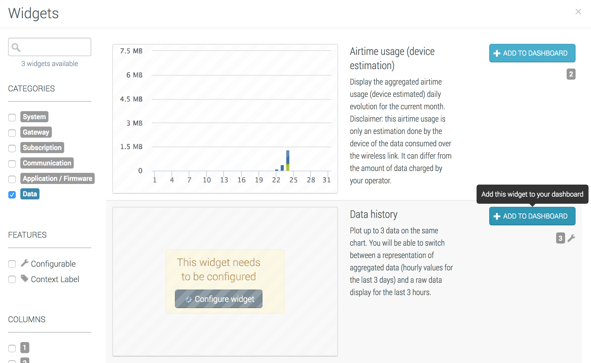
- Select Single Value Widget in the list and click on Add to Dashboard
- Finally, configure your widget in the next section.
Configure the widget
To open the configuration dialog box:
- Click on the Configure on the top right corner menu of the widget to edit your widget.
- You access to the Configuration view of your widget.
Select your data
By default, if you add a widget in the start page, the data value will be computed by using the fleet aggregation. You can select a specific system, if you want to highligh a system.
If you add a widget in a system dashboard, the data from the system will be used by default, but you can show the fleet aggregated data value if you want to show the global behavior of the fleet in the system’s dashboard (and then you can compare it with your system for example).
You can then select the data:
- For a fleet, click on the glass, select application data if you want to select your application data, select your application and then your data and click on Select
- For a single system, you can select your data directly in the drop down list. You can filter your data by starting to type the name in the field.
Select your aggregation
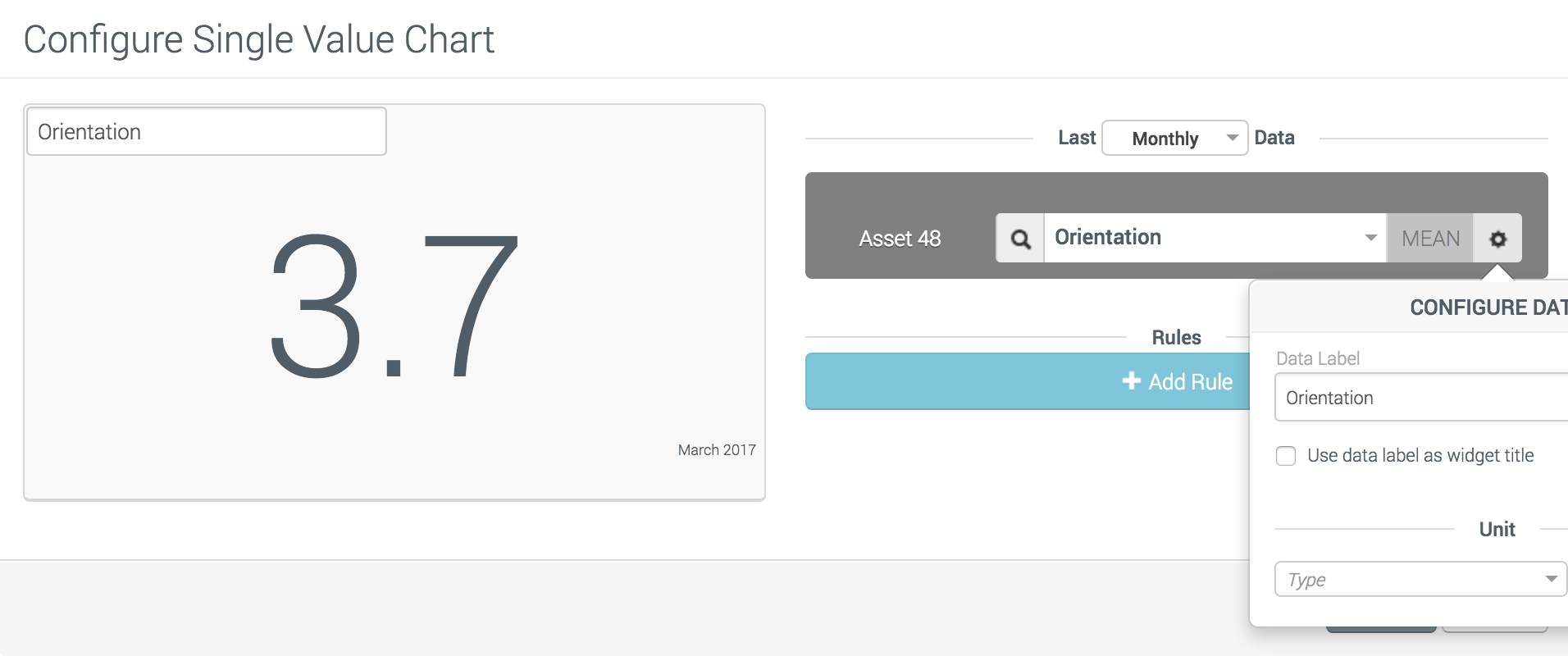
Now the data has been selected, you can choose if you want to show the last value or a computed value on a given period of time. For example, you can show the last hour mean value of a temperature, the sum of a data value during the last month…
To configure such data, select the time aggregation on the right of the data field: raw (no aggregation), mean, minimum, maximum, sum, count. If one of the time-aggregations is selected (that means any except RAW), you can select the period of time to apply the aggregation: Monthly, Daily or Hourly at the top of the widget configuration dialog.
Configure the data format
Further right, again, you can click on the gear button in order to configure what to show in the widget:
- Data label: By default, the data label is used for the widget’s title. You can modify it or uncheck in order to fill the title directly in the sample on the left.
- Unit Type: Choose one of the available unit or type your own unit to add the unit right after the value (only available if the data type is a number)
- Precision: Configure the number of decimal digit to show (only available if the data type is a number). The value is rounded.
Rule configuration
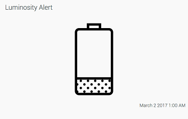
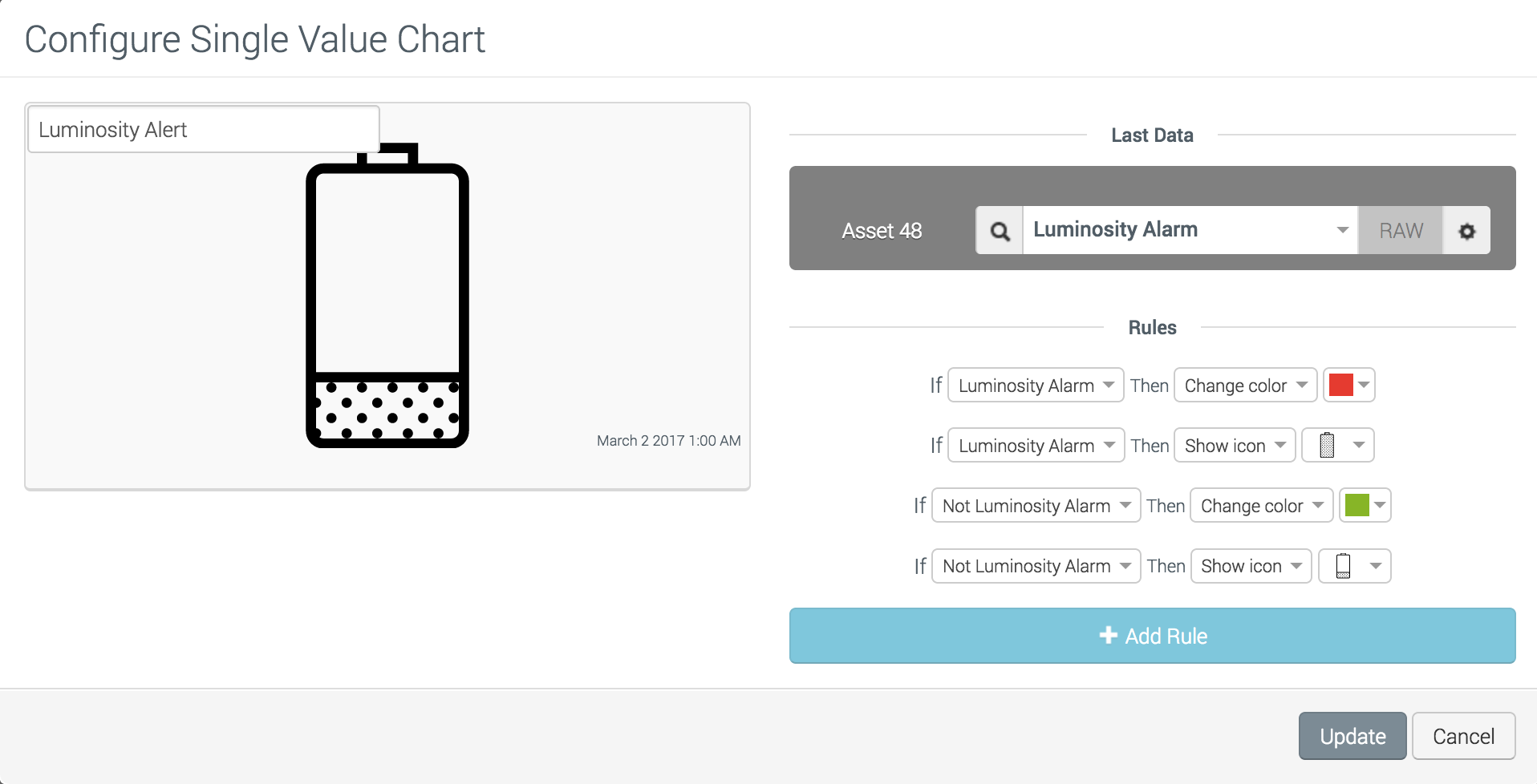
Finally, typically for boolean values, you may want to show a custom icon instead of true or false which is not user friendly:
- Create a new rule to define what to show according to the value. Various operators are available according to the data type.
- Select the operator (for number and string data type)
- Select the right operand (for number and string data type)
- Select the action (change icon or change color)
- Configure the action (the color or the icon)
You can define 2 rules to be applied on the same condition, one to set the icon and the other to change the color. If the two rules execute the same action, the last in the list will be effective.


