Dashboard
 Initializing Table Of Contents...
Your dashboards
AirVantage provides dashboards that are available troughout the product to provide greater insight into your systems.
The Dashboards are configurable so you can get a quick look at the information that is the most important, in the correct context in your use of AirVantage.
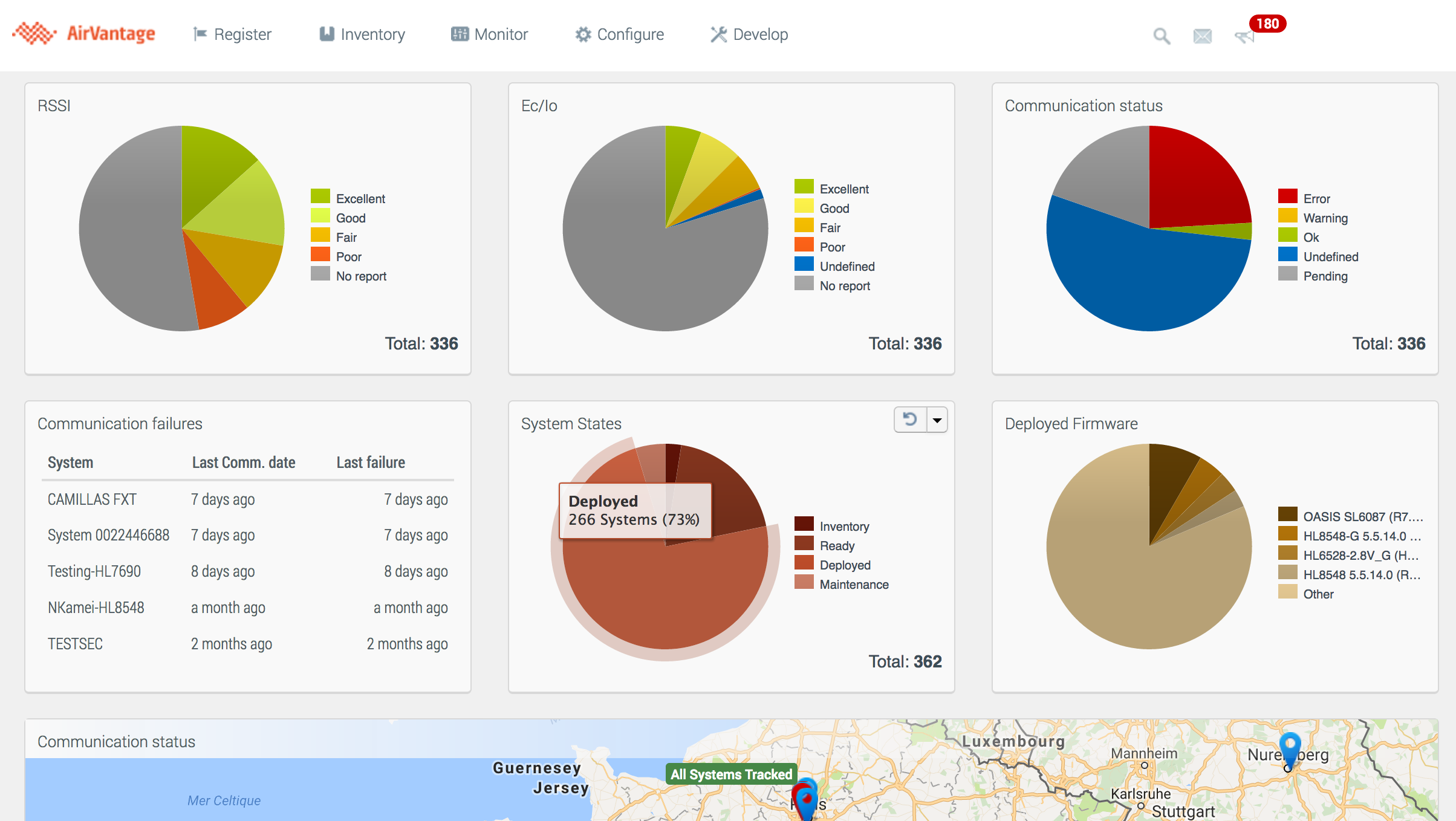
The start Page
This main dashboard can display information about the fleet or about a single system you want to monitor closely. It provides the greatest variety of options to configure
You can always access to the dashboard clicking on the AirVantage logo at the top left.
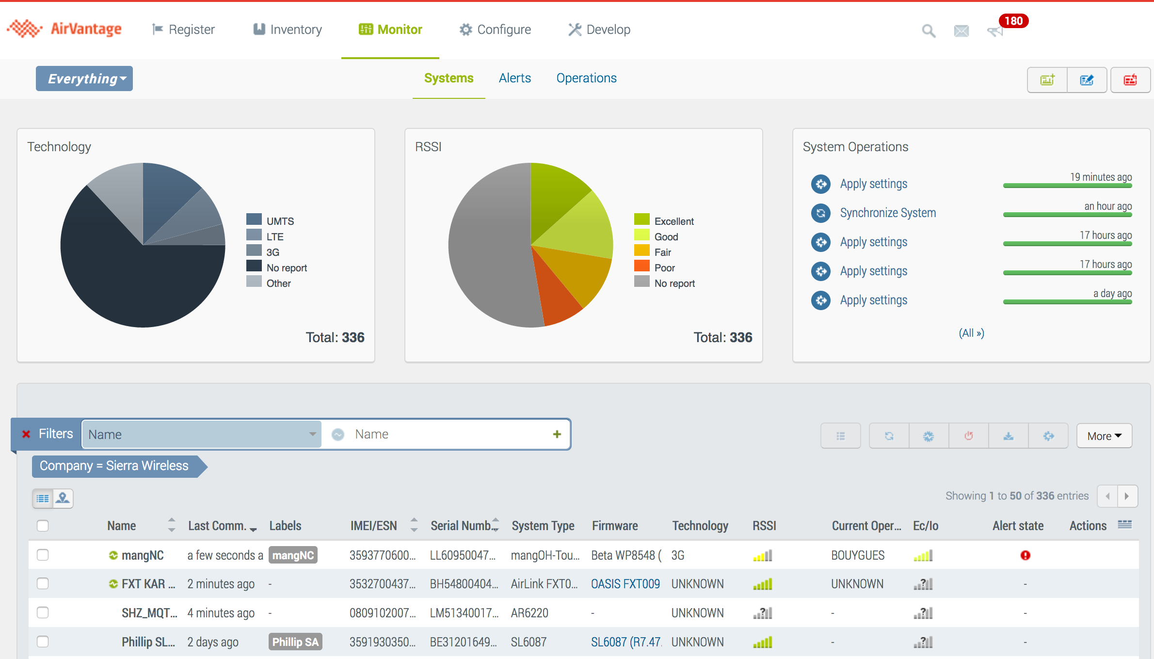
The Systems Dashboard
This page displays basic information about your systems at a glance.
You can access it from Monitor > Systems.
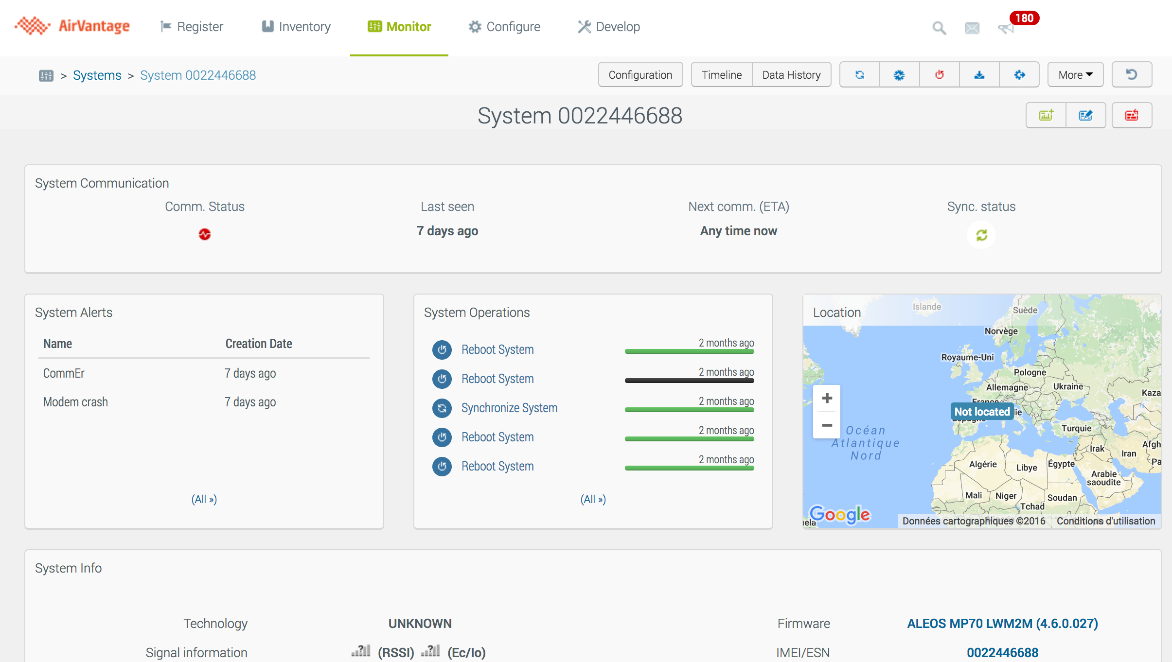
The System Detail View
This page allows you to display information about the selected system, and provides system-specific widgets.
You can access it from the previous dashboard and click on a system in the table.
Organize your dashboards
You can create multiple dashboards for the start page (fleet dashboard) and the system’s details page. The Monitor Systems view can just have a single dashboard. All accounts come configured with a dashboard that provide the most commonly used widgets, in a layout that is designed for most users.
All dashboards are created as private (only available to you) and you have control to change the default dashboard to be displayed for a System or in the start page for all your devices. This enables you to:
- Design one or more dashboards to address specific use cases
- Use dashboard configurations temporarily or for more long-term requirements
- Build multiple views of your fleet for a greater visibility
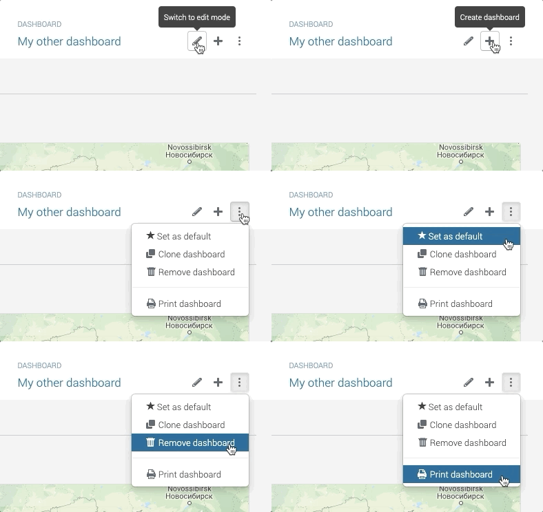
To manage your dashboards, you can:
- Create a new empty dashboard
- Create a new dashboard from a current one: Clone an existing dashboard and modify it
- Set the default dashboard to be one you have created or use the initial dashboard depending on your requirement
- Delete a dashboard when you don’t need it anymore. If this is the current default dashboard, the new default one returns to the initial dashboard.
Share your dashboards with your team and partners
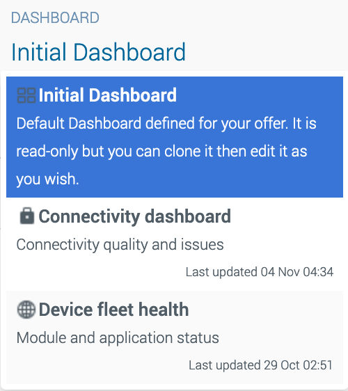
The list of dashboards can be accessed through the combo list on the top right of the dashboards. You access to the private and public repositories:
Initial dashboard: The initial dashboard can not be modified and this dashboard will be always available as is. If you want to modify it, clone it and edit the newly created dashboard. This dashboard is nammed Initial Dashboard.
Private Dashboards: By default, your dashboards are private dashboards. This means that you, and only you, can view, delete or update your dashboards. The first one shown when you display the page is the default dashboard. The default dashboard is identified with a 4 squares icon on the left.
Public Dashboards: You can share a dashboard to other user in your company (in a public repository). The dashboard is in read-only for all the users but the Administrators. See How to share a dashboard for more information. A public dashboard is identified with an eye on the left.
Finally, you can transfer a dashboard to a partner. The dashboard will be copied to the new company as a public dashboard. If you modify the dashboard, the transfered dashboard will not be changed. See How to transfer a dashboard to a partner for more information.
Use your dashboards in full screen mode with auto refresh
Auto refresh mode
The AirVantage dashboards use the available data when the dashboard is displayed so you can analyze your fleet or system status but by default but the data are not updated. If you want an up-to-date status displayed in the dashboard, you can use the auto refresh mode which updates the data in each widget at given period.
This period is 1 minute at the minimum and can be configured according to your use case and device communication policy.
24h after the login, the user must login again for security reasons.
Full screen mode
You may want users to view a dashboard without all of the navigation toolbars, menus, and panels of your browser. Hiding the navigation information:
- Focuses attention on the data itself
- Allows for easier analysis of the data by maximizing the number of widgets shown at the same time
- Allows to share your metrics by casting your dashboard to a TV in a control center by using auto refresh and full screen modes all together.
Design your dashboard
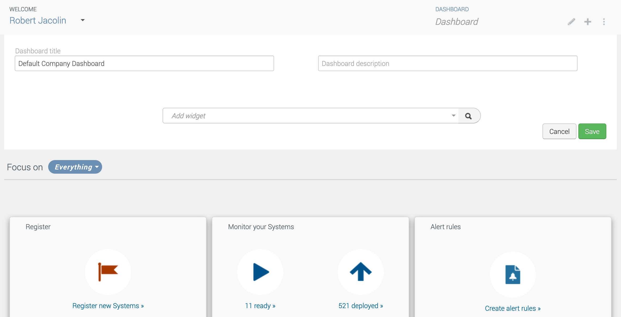
To change the dashboard layout, you need to switch into ‘Edit mode’. Once in Edit mode, you can easily:
- Change the name and the description which will be used in the dashboard list
- Add or remove widgets
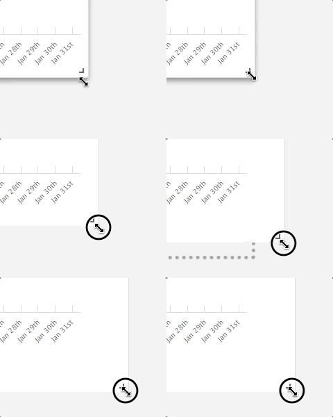
- Resize existing widgets
- Move widgets around to have the most important ones on the top and create a layout that works for you
Add widgets
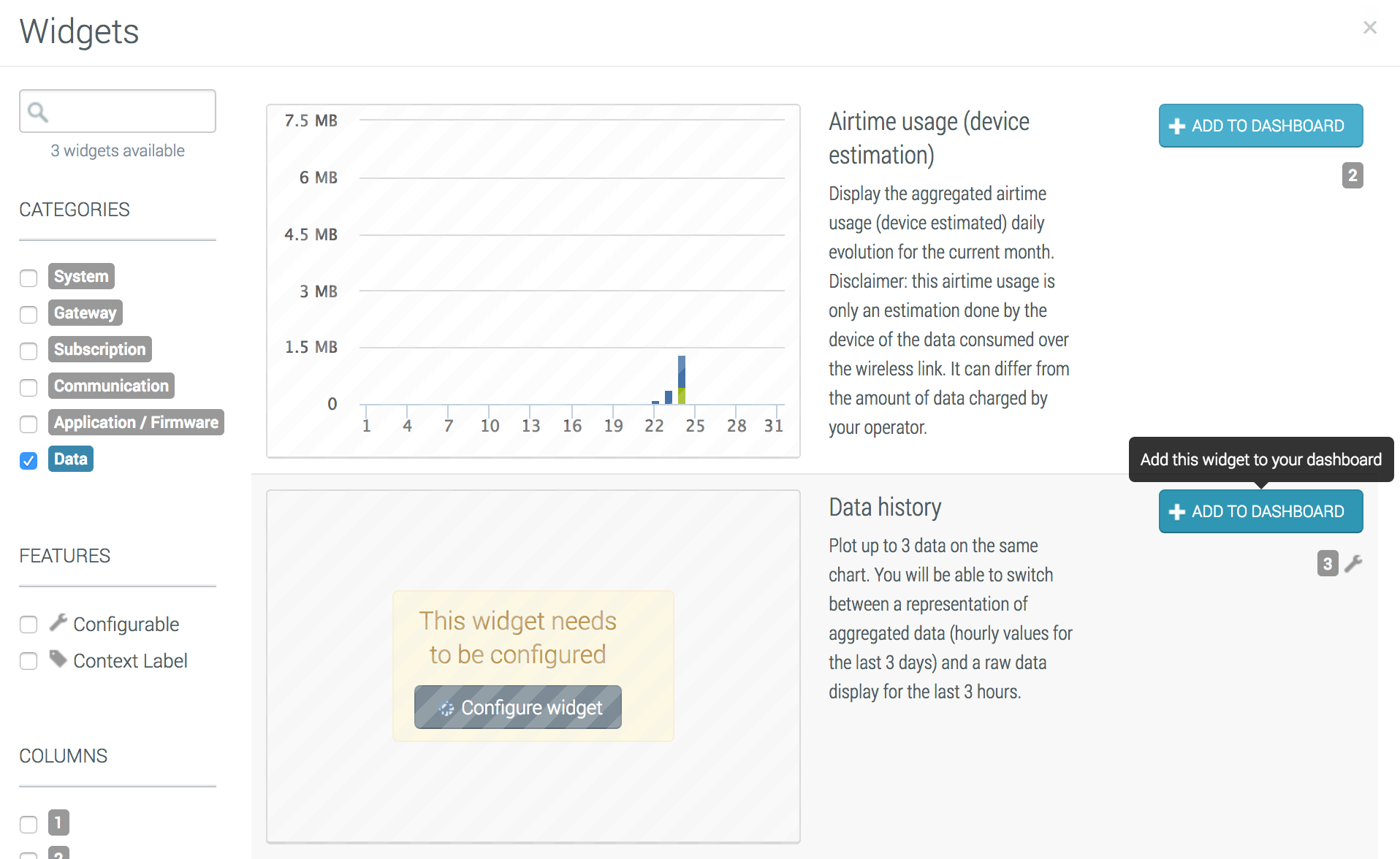
Once in ‘Edit mode’, use the quick search drop-down box listing widgets by name, or select from the well-known widget gallery by clicking on the magnifying glass button. The widget will be added to the bottom of your dashboard. You can then move it where required, and do any widget specific configuration that is required.
Once you are satisfied with the look and feel of the modified dashboard, click on Save button to validate your changes.
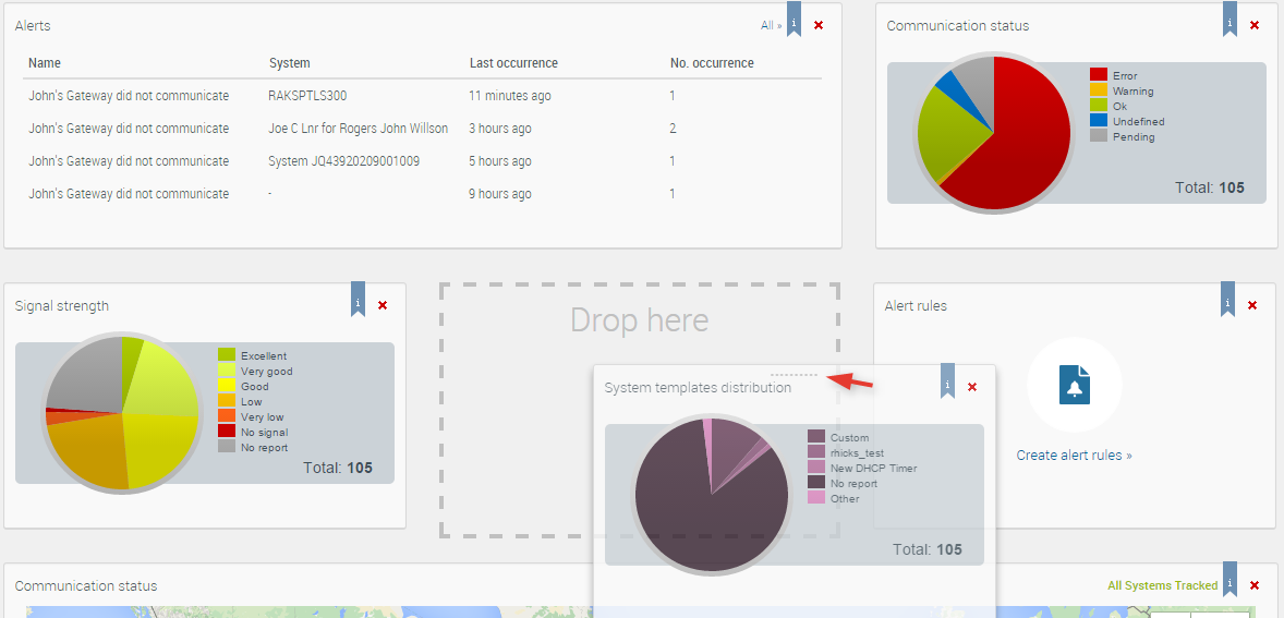
Drag and Drop
You can position the widgets as you wish to obtain the desired dashboard layout.
Just drag a widget and drop it on an existing widget slot. Widgets are then automatically switched.
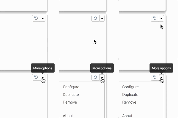
Duplicate a widget
Click on Duplicate in the top right widget’s menu. The new widget will be added to the right of the current widget.
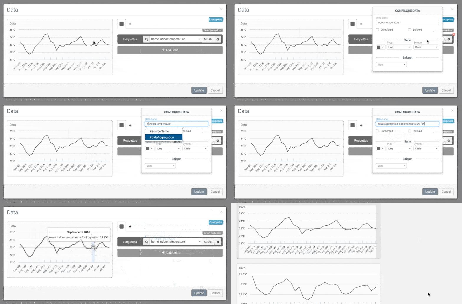
Common Configuration for all the widgets
Typing # will enable you to include variables inside your label like:
#sourceName: Name of the current datasource (company name if datasource is fleet, system name if you selected a system)#dataAggregation: Type of aggregation (mean, sum, …)#dataInterval: Time of aggregation (monthly, daily, hourly)
Widgets have a wide range of configuration capabilities. Some are simple and require no configuration; some are more complex and require more information.
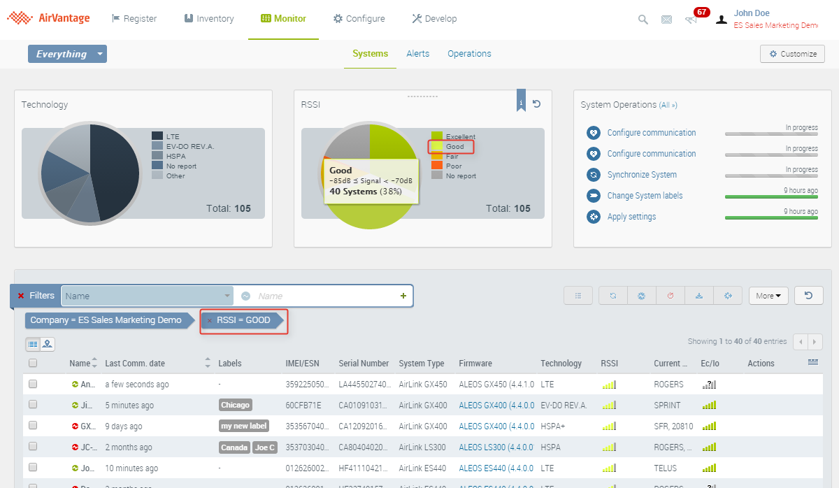
Use widgets to filter entities
Widgets can be used to filter entities. In the example below the systems with Good RSSI level are filtered clicking on the slice Good of the RSSI widget. All the pie charts offer this capability:
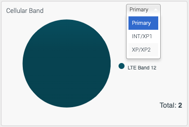
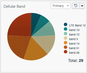
Cellular Band Widget
The Cellular Band widget is available in the ALMS offer for multi-radio routers running AirLink OS. It is not supported on ALEOS devices.
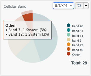
The widget shows the current number and distribution (by percentage) of systems using each band. The data displayed is based on the system’s last recorded Band value.
The 6 most represented bands are displayed, with the rest of the bands grouped under “Other”. However, if the “Other” category only contains 1 band datapoint, then the band will show as its own category instead of “Other”.
Time Display
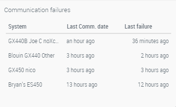
Date and time is displayed in relative time (for instance 10 minutes ago, not February 13th 2019 2:05 PM) along with the full UTC Date and Time displayed in a tooltip when hovering over it.
Time display for each range is outlined in the table below:
| Range | Key | Sample Output |
|---|---|---|
| 0 to 45 seconds | s | seconds ago |
| 45 to 90 seconds | m | a minute ago |
| 90 seconds to 45 minutes | mm | 2 minutes ago … 45 minutes ago |
| 45 to 90 minutes | h | an hour ago |
| 90 minutes to 22 hours | hh | 2 hours ago … 22 hours ago |
| 22 to 36 hours | d | a day ago |
| 36 hours to 25 days | dd | 2 days ago … 25 days ago |
| 25 to 45 days | M | a month ago |
| 45 to 345 days | MM | 2 months ago … 11 months ago |
| 345 to 547 days (1.5 years) | y | a year ago |
| 548 days+ | yy | 2 years ago … 20 years ago |
Tracker Widget
Tracker shows you the near real-time location of your routers on an interactive map. It is especially useful for monitoring a fleet of vehicles, and can display up to 20,000 systems concurrently.
It includes filtering and clustering features to make it easy to look at the whole fleet, or to focus on individual vehicles.
See How to Use the Tracker Widget and Configuring the router for the Tracker Widget for more information.
Data Widgets
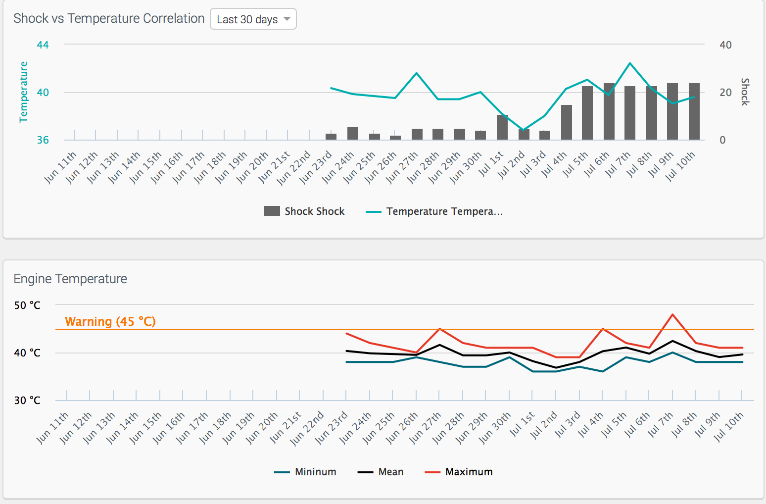
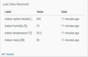
This is a subset of available widgets. A lot of pre-defined widgets are available, which you can use without any configuration.
Single Value Chart
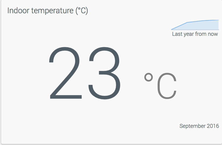
A Single Value Chart shows a single data value. You can apply rules, to adapt the content.
Data History Table
A Data History Table shows the data value history in a table. Each data are displayed in a row. You can select the period to display.
Data List
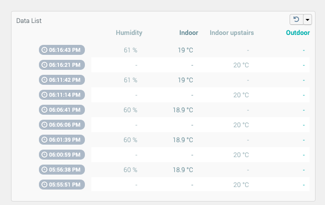
A Data List shows the data value history in a list. Each value is displayed in a row. You can select the number of row (default is 20, maximum is 50).
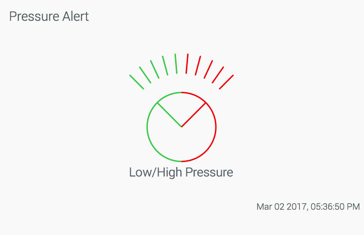
Gauge Charts
For all the type of gauge, you can configure the minimum, the maximum level and the colors for each area.
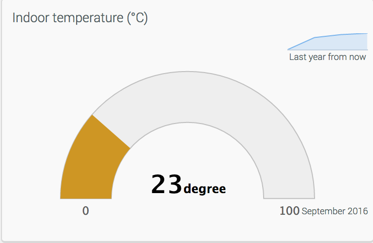
Angular Gauge
An Angular Gauge displays a gradient color which is displayed only from the lower limit until the current limit.
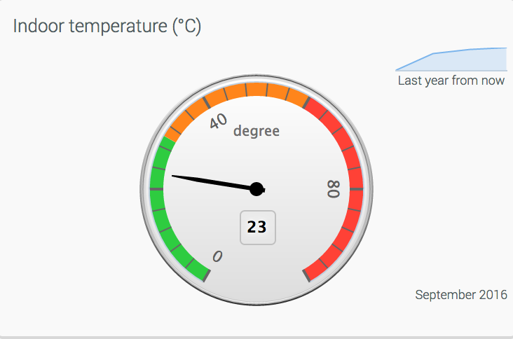
Solid Gauge
A Solid Gauge displays a gauge with always displayed color areas so that you can easily visualize the range your reported data is in. You can configure the number of marks and the associated labels.
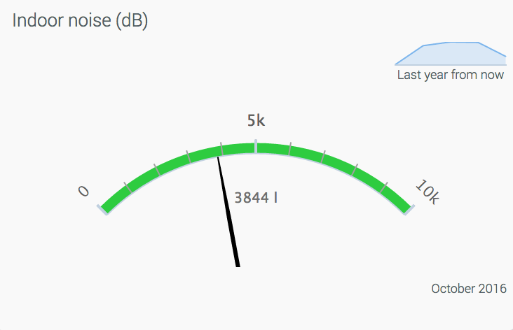
VU Meter
A VU Meter is an analogic-like meter. The 3 areas are always displayed.
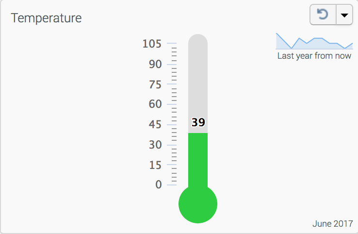
Thermometer
A Thermometer is a vertical gauge. The color highlights the zone corresponding to the value. You can configure the number of marks and the associated labels.
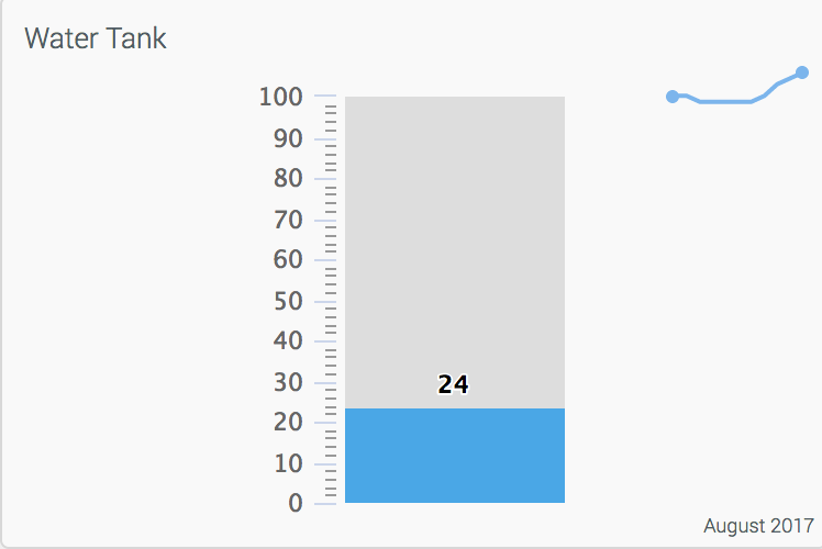
Tank
Like the Thermometer, the Tank is a vertical gauge. The color highlights the zone corresponding to the value. You can configure the number of marks and the associated labels.
Other Widgets
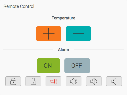
Command Widget
This widget displays buttons to send commands to the device. Parameters can be configured. If any mandatory parameter is missing, the user has to define it right after clicking the button.
Text Widget
Add more context (like pictures, formatted text, links) about your systems. Add references to your corporate technical documentation about your machines, display your logo…
Main Life Cycle Dates Widget
This widget provides insight into the state of your System in ALMS. The widget provides the following information on four dates:
- Creation Date: The date that the System was created in ALMS. This is typically the date that the router was registered into ALMS.
- Activation Date: The date that the System was activated on its offer in ALMS. In most cases, the Creation Date and Activation Date are the same date (generally separated by a few seconds), as the default behavior is to activate upon registration. It is possible to delay activation for up to 60 days, so these dates may be different.
- Last State Change Date: This date reflects the most recent state change to the device. For most ALMS users, this date is generally close to the Creation Date or Activation Date for the first year of the System’s life. It could be different if an older device (one not eligible for AirLink Services) was registered, was then suspended and reactivated at a later date, once services were renewed. Generally, this date will remain constant throughout the life of an AirLink router.
- End of Engagement: This date indicates the end of the service contract period. In this example, the AirLink Complete service for the AirLink XR60 was valid for 1 year, showing that the end of the original engagement period will expire on October 16, 2024. You can also refer to the Services dates in the Monitor > Systems table for this information.
Alert Widgets
Alert Status Widget
This widget shows a textual and graphical view of the current state of an alert. It’s up to you to define what to show based on the state of the alert.
Alert History Widget
This widget shows the recent history of the system’s alerts on a graphical view. You can browse the alert history within a given period, zoom on a given date and hide alerts in the graph by clicking on the bottom legend.
This widget is only available in the System Detail dashboard.
Note the color code for each rule is the same as in the Alert List Widget.
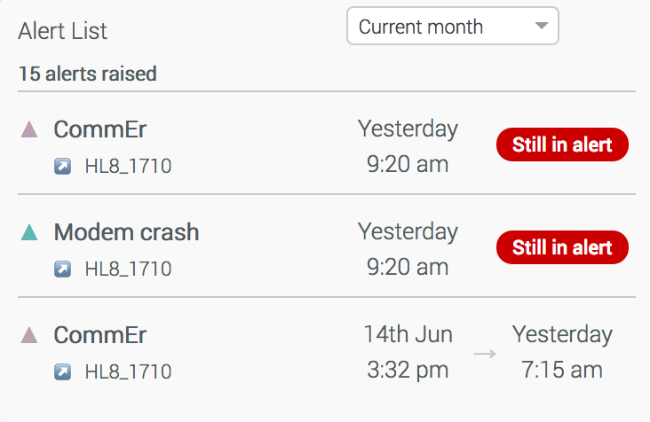
Alert List Widget
This widget shows the alerts as a list. It is available both for the fleet or for a specific system. You can filter the alerts to be shown by rule or limit the display to alerts still ongoing. From this widget, you can:
- click on the system name to show all alerts for a system (available only for fleet version in the start page dashboard),
- click on the alert name to show all systems with the same alert,
- click on a link to go to the system details in order to investigate deeper,
- show a popup with the alert duration when hovering over the start or end date of the alert.
How-Tos
This section provides you with helpful procedures for common tasks.
