How to display your data in a combo chart?
 Initializing Table Of Contents...
This page explains how to display data in a chart: bar graph, trend.
You can display charts in 3 locations in AirVantage:
- The Start Page by clicking on the logo on the top left corner in AirVantage to display a dashboard about your fleet
- The System Details View from Monitor > Systems and selecting your system.
- In the same way, from the System Details view, you can access to the Data History View by clicking on Data History in the top menu. See this tutorial
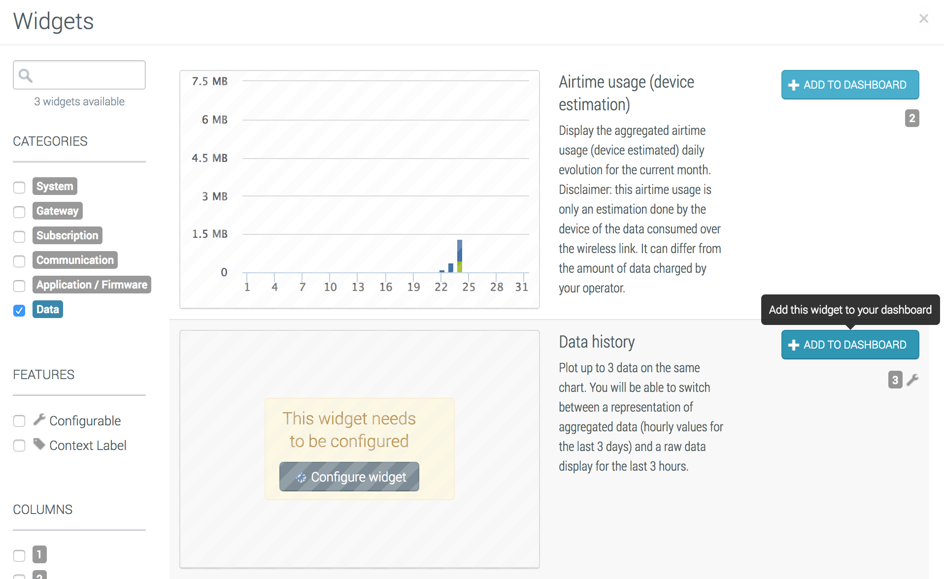
Add a new chart
- Click on the green dashboard edition button in the top to add widgets to your dashboard
- Select Combo Chart Widget in the list and click on Add to Dashboard
- Finally, configure your chart in the next section.
Configure the chart
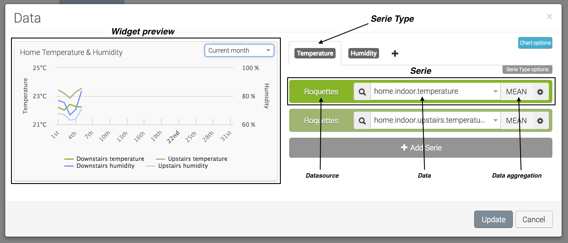
To open the configuration dialog box:
- Click on the Configure on the top right corner menu of the widget to edit your widget.
- You access to the Configuration view of your widget.
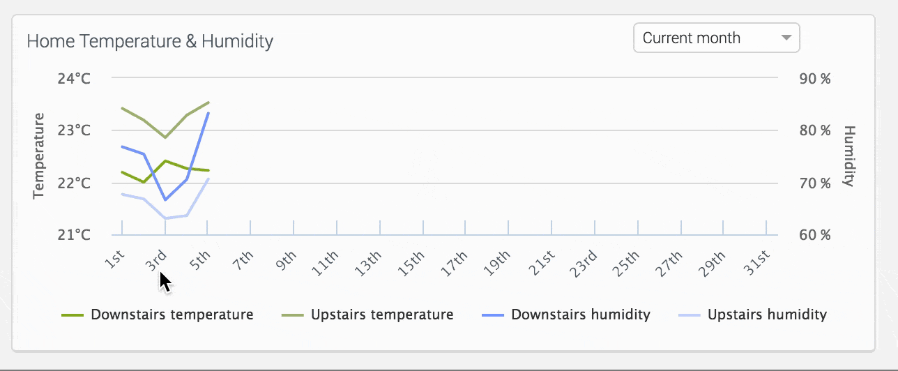
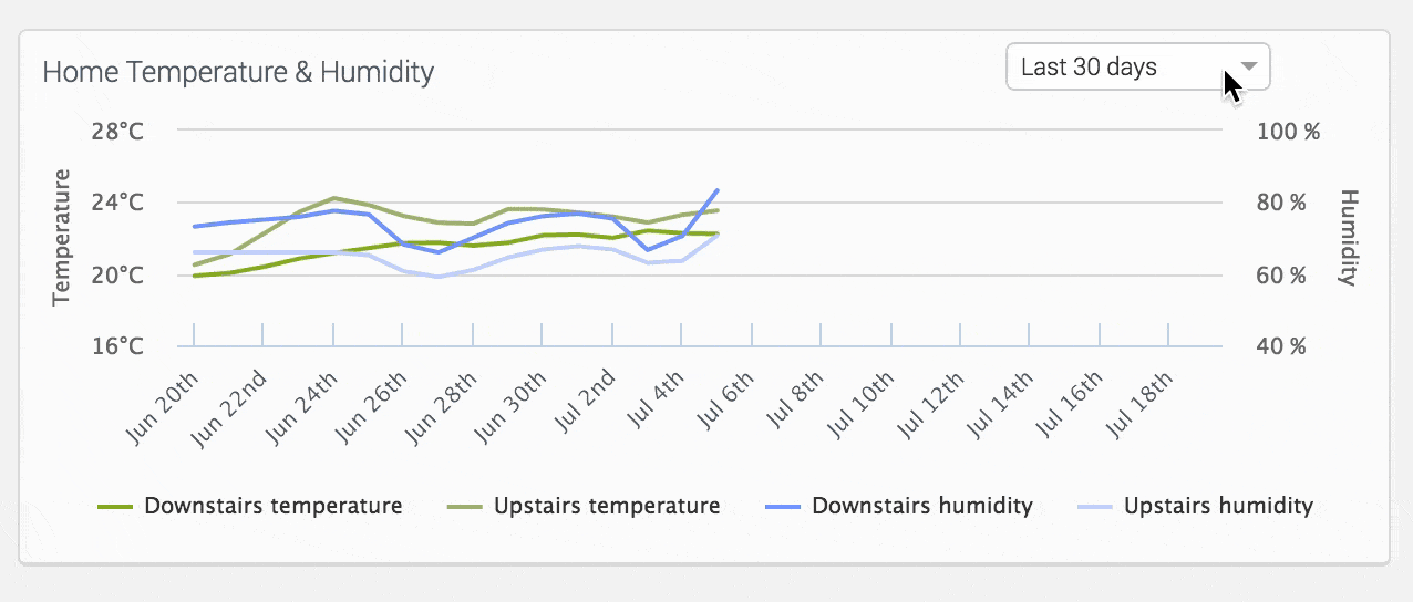
The chart can display several sets of data sharing the same axis, unit and a limit (a threshold to display on the graph). For example, you can display:
- a first data series with 3 curves: min, mean and max temperature
- a second data series with 3 more bars: min, mean and max pressure
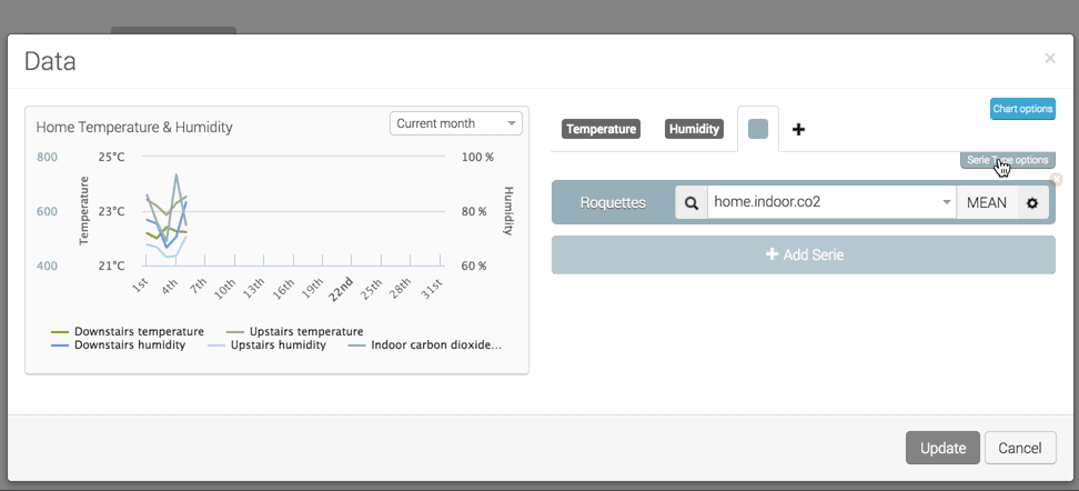
Chart Options
The chart options supply these options:
- Show Legend: shows the data label and the series labels in the widget
- Time Navigation: shows a drop down list in the top right corner of the widget allowing to show various periods. This option is only available with the Aggregated data mode.
Data Series
When opening the chart’s configuration dialog box, a first data series is defined. You can modify it and add a new one by clicking on the Add series button below this first data series.
Configure a data serie
Each Series is composed of:
- A Data Mode selector allows to select the data value to show: either the last data value received and stored by AirVantage or a time-aggregated value. In this last case, the function described below is available. The data mode is a global parameter for all the series.
- A Source selector allows to show the data from the current system or computed from the system’s fleet. In this case, you can select an aggregation to define how to compute all the data comming from each system.
- A Data selector, with all data about your system: device, connectivity or applicative data (defined in the Application Models for the current System). Only numerical values are available, and can be used as input data of each graph. You also have the possibility to add a new Data identifier in the case a Data identifier is not specified in the Application Model.
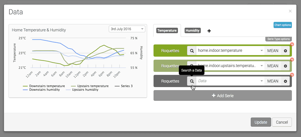
Data serie Options
If you click on the gears icon on the right, you display the option for this data series. You can change chart type (histogram or line chart), the color, the symbol used for the line type when hovering and the label.
Two more options called cumulated/Stacked and the snippet can be selected and are described below.
Cumulated & Stacked Option
Cumulated can be applied for line chart only. It sums the new value with the previous one in order to cumulate the values. For example, if the device sent a production in the last hour and you want to display the quantity of production.
Stacked Option can be applied for histogram (bar graph) chart only. Each data series is stacked on the same bar. Otherwise, for each period of time, a bar will be displayed for each data series.
Serie Type
A data series is a group of data sharing the same unit, axis and a common threshold. By default, each data to be displayed will use the data series color.
You can add a new data series by clicking on the + tab.
Serie Type Options
This dialog box can configure
- label: name, color and position
- unit: name and precision. The unit is mandatory to set the precision. The value is rounded in the tooltip
- limit: display a colored horizontal line to highlight a specific threshold with a label.
Use the chart
If the time navigation is displayed, you can click on a date in the x axis to zoom on a specific month, day, hour.