 Searching...
How to browse your data history in a chart?
You can display charts in two locations in AirVantage:
The System Details View from Monitor > Systems and selecting your system. See this tutorial
In the same way, from the System Details view, you can access to the Data History View by clicking on Data History in the top menu.
These dashboards are customizable: you can edit, move or delete existing charts or Add chart of your own.
Using the Data History View
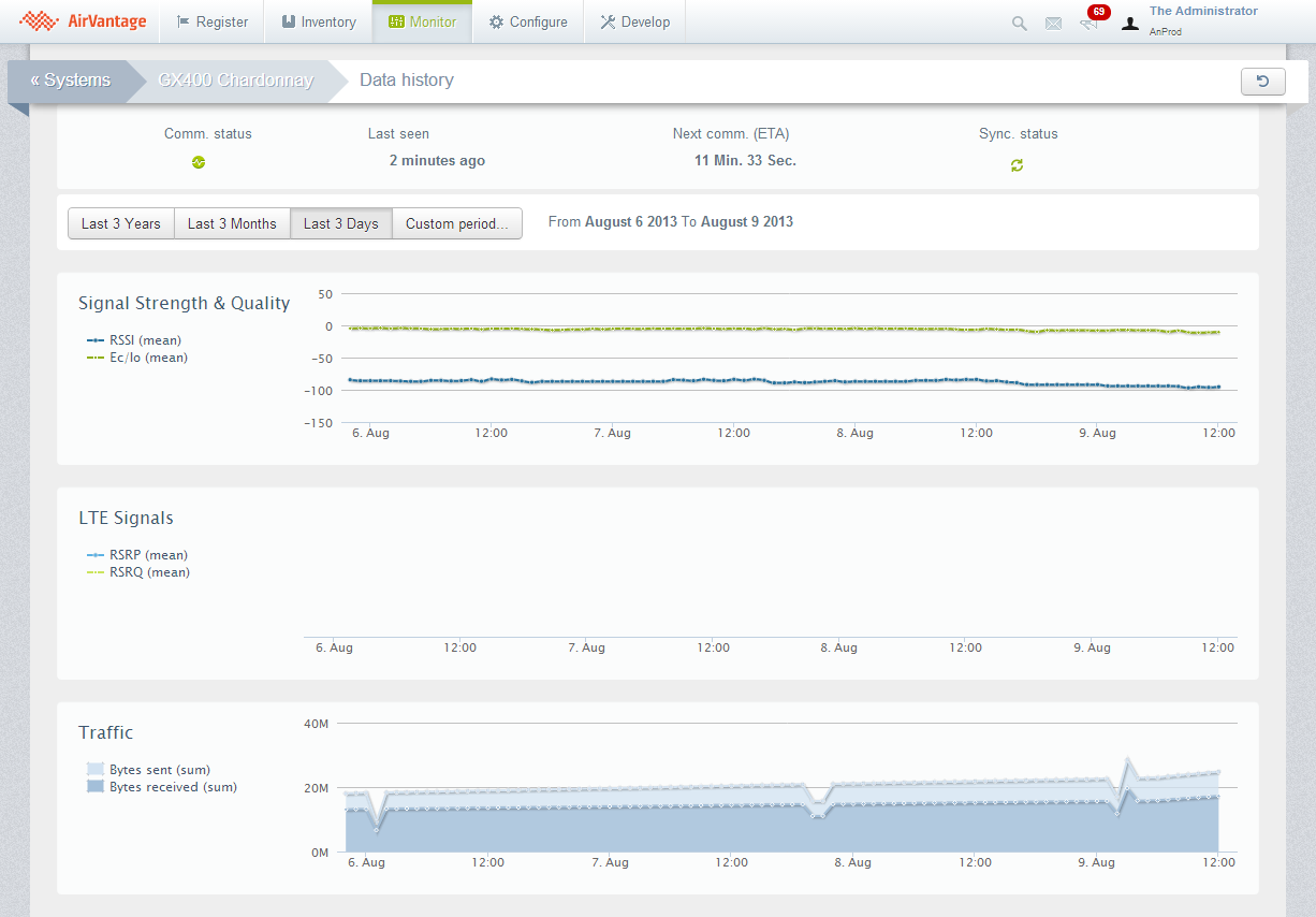
The Data History screen is a ‘configurable’ dashboard to visualize aggregated data for a given System. It is composed of three main parts.
System Communication
System communication information (Communication status, Last communication date, Next Communication date (ETA) and Synchronization status) displayed on top.
Browsing your data
A period selector which proposes the 4 following predefined options:
- Last 3 Years: Display monthly values for the last 3 years
- Last 3 Months: Display daily values for the last 3 months
- Last 3 Days: Display hourly values for the last 3 days
- Custom period…: Display hourly values for 3 consecutive days of choice in the last 100 days.
The Dashboard
The dashboard can be composed of an unlimited set of charts. Each chart is composed of up to 3 sets of data to which is applied a mathematical function (min, max, sum…).
By default, there are three charts displayed:
- Signal Strength & Quality, including the _RSSI and _ECIO device management data
- LTE Signals, including the _RSRP and _RSRQ device management data
- Traffic, including the _BYTES_SENT and _BYTES_RECEIVED device management data
Add a new chart
You can click on the Add chart button to configure a new chart for the dashboard. The dialog supplies a chart selector including the Custom Chart (selected by default) and some predefined chart configurations.
The Custom Chart allows you to configure the chart (see the last section).
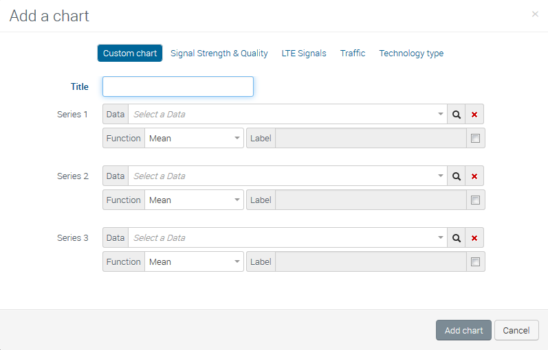
Configure a chart
To open the configuration dialog box:
- Click on the gears icon on the top right corner of the chart widget to edit your chart.
- You access to the Configuration view of your chart.
- The possibility to configure up to 3 Series.
Each Series is composed of:
- A Data selector, with all Data defined in Application Models for the current System, but also some Device Management Data. Only data with numeric type are proposed. The user has also the possibility to add a new Data identifier in the case a Data identifier is not specified in the Application Model.
- A Function selector (Mean, Sum, Minimum, Maximum, Count, Standard deviation, Sum of squares). This function is used to computed a single value when several values are available for a given period of time. For example, if you have one data per 30 minutes, the chart will aggregate all the values for each day in a Last 3 Days view by using the function. In the Last 3 hours view, the raw data will be used without using this function. You can see the function displayed in the label as a remainder.
- A customizable Label for the corresponding Series
- A Delete action to remove the selected Data and reinitialize the Series configuration
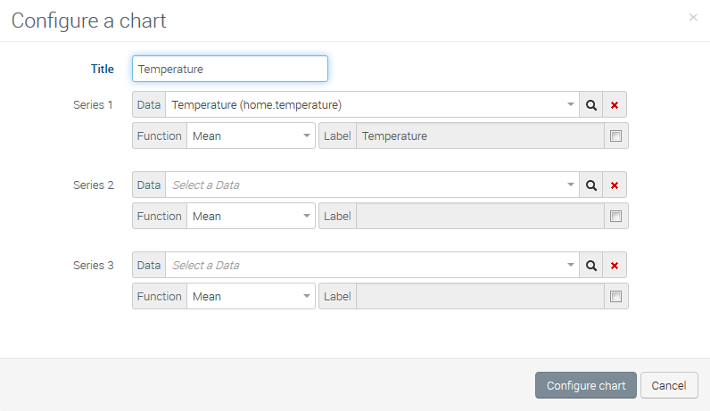
Only numerical values are available, and can be used as input data of each graph.